Of COVID-19, Miniatures and the Classics; Or: THE “ART” OF DISTRACTION

In this time of “social distancing” and “flattening the curve” it’s easy for an introvert like me to finally feel justified in being a homebody and preferring one’s own company for hours on end.  If you’re a quilter (or painter or writer or musician) it’s also society’s permission — not to mention “Doctor’s Orders!” — to hunker down and let the creative juices come to a boil.

But this is a time of anxiety and worry, as well. Will the nurses in my family be safe? Will my grandchildren be able to finish out their schoolyear? Will there be enough bread or pasta or soap in the grocery stores? Whom do I know and love who might be carrying the virus; or worse, actually getting sick with it?

To distract my mind from these worries and fears, I choose another miniature quilt to focus on my attention on. I have a collection of patterns created by Lori Smith and in the past week or so I’ve made four more of them.

As a good friend commented, miniatures are perhaps a good analogy for these times when life is greatly contracted to the space of our homes and the smallest of social gatherings. Questions as basic as, Will I run out of soap or tissues tomorrow? What do I make for dinner from whatever is left in my larder? Should I go out for walk, or find a way to get my exercise indoors? How do I keep my house clean enough to prevent contamination? … All these questions seem like the perfect backdrop for cutting the smallest of pieces and having to carefully watch the quarter inch seam in a long string of One-Inch Squares, Half-Square or Quarter-Square Triangles.

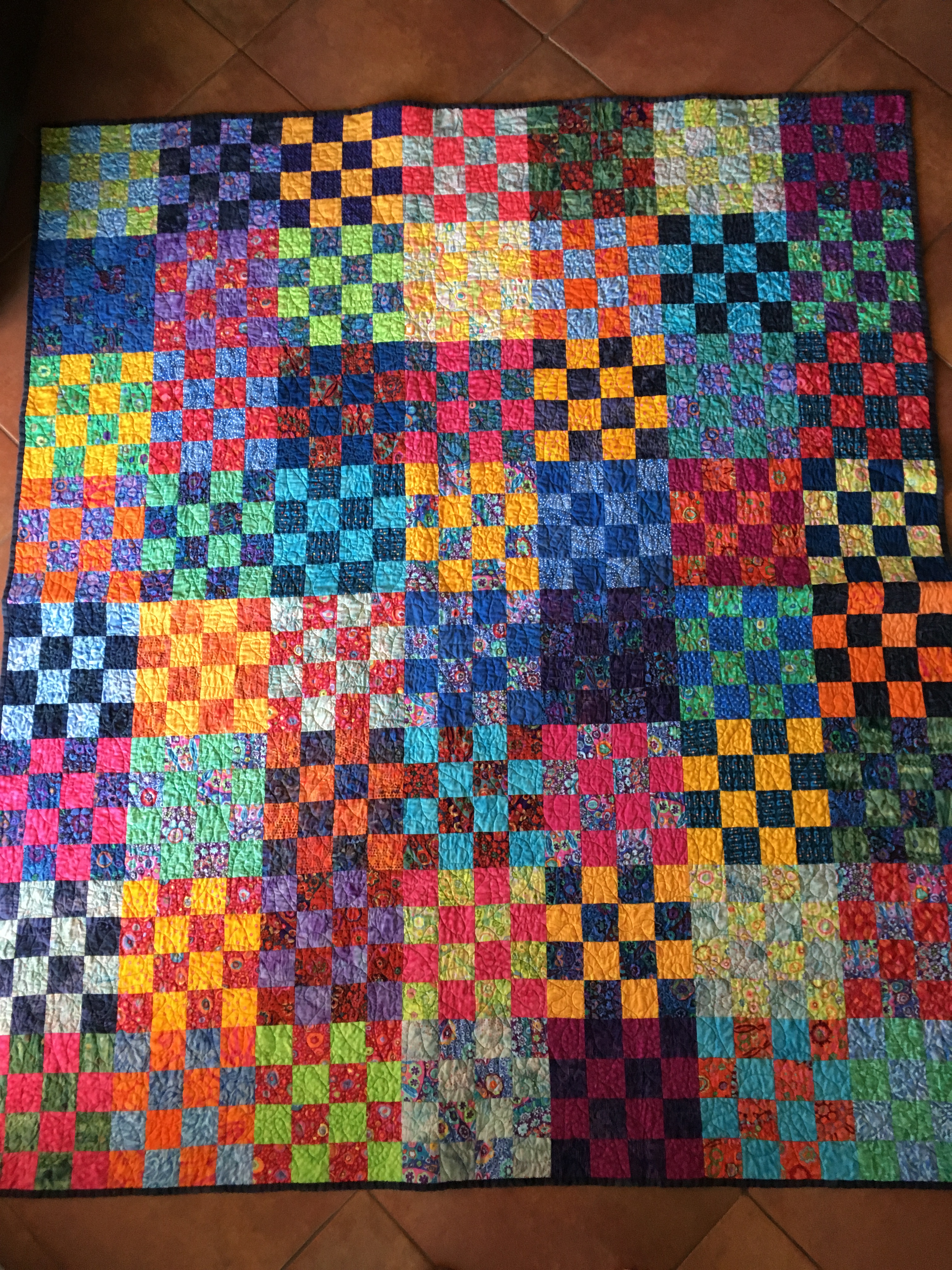
And if, like me, you have bags of tiny scraps that you’re loathe to ever discard, then a miniature is the perfect time to dump them out and start the hunt for just the right shade of colors. These days my preferred fabrics are the 1800 Reproductions — the “Classics” of the quilting world — and the colors I keep being drawn to are the dark reds, blues and browns.  And a bit of gold to sing out.

Also, I keep remembering a quote from a journalist a few years ago that went something like, “In times of stress or crisis, read the Classics. They have a way of grounding you.”

From my own bookshelf I have dusted off two: Albert Camus’ The Plague — [Because it seems as good a time as any!] — and Charles Dickens’ Dombey and Son [Because it has lots and lots of pages].  And with apologies to Marie Kondo, author of The Life-Changing Magic of Tidying Up, who seems to believe no one needs more than 12 books in one’s house? (Or is it 6?!) and that if you’ve had a book longer than 3 months and haven’t read it, you can declutter by discarding it, well, I have had The Plague and Dombey and Son on my shelves for years and it makes me just so happy to say it. NOW has come the time for the reading of them! No risky outings to a public library (which has closed anyway) or book store needed! Just titles selected from my own bookcase.

And so, the rich dark browns, blues and reds in my 16″ X 20″ miniatures, as well as the language and imagination of fine writers, are providing the ground that I need underneath me now to keep from panicking; to give me the perspective of history and universal human experience; to help me reflect on the things that are most essential in life, things such as how to be human; how to maintain patience and compassion; how to keep faith, to practice empathy, to remain generous and moral.

And having to choose just the right shade of brown (the color of the earth) or blue (the color of water and sky) or red (the shade that runs in all our veins and reminds me that we are all in this together, that we are all one human family!) in order to create something lasting, something pleasing to both hand and eye — no matter how small … Well, what better way to dispel the scary noise and darkness? What better way to quiet the worrying mind? What better way to pass this time of isolation? 

I can only hope many countless others are finding ways to cope. And not only to cope, but to rise above the fear and anxiety, and instead, to create, to stay strong, to keep loving. Not only to cope, but how to BE on this strange and particular ground.


A quilt for a very sad story

fullsizeoutput_ff8

This is a quilt-story I’ve been anxious to share ever since I started making it. Now that the quilt is finished I can.

The pattern comes from a book by an Australian artist/quilter/writer, Kathreen Ricketson and the book, as you can see, is titled Brave New Quilts. I’ve had the book in my library for a few years and this year decided that before I donate it to the library, I should at least make ONE quilt from it.

Tragically, Kathreen and her partner died while snorkeling off the coast of Western Australia, (and just as the book was being released, as I understand, so that all proceeds of the sale of the book would go to help their two school-age children.) The initial reports were that they died of jellyfish stings while their children observed from the shore.  What unimaginable horror for them! But a coroner declared the deaths were by drowning. Here is a link to the newspaper report: Kathreen Ricketson’s death. 

Brave New Quilts is a beautiful and imaginative study in quiltmaking that also contains a mini Art History lesson in every chapter. The way she stages and photographs her quilts is just wonderful.  And her quilts illustrate so well each period that there are actually several I’d like to try my hand at, following her inspiration and instructions.

The quilt I chose first was from the period Art Nouveau, of which Gustav Klimt is perhaps the most famous artist. This is what Kathreen says about the color palette for her quilt, which she names, Peacock Blue. “Colors in this era were rich and luxurious and exotic. Peacock blues, purples, greens are synonomous with this era, as are gold and shades of bronze and silver.”  

(I guess, having grown up in India, it’s easy to see why I’d be drawn to a quilt referencing peacocks!)

So I started off using the same palette as she does — blues, greens and deep yellow/golds — for the long panel of half-square triangles (HSTs in quilting parlance.) And it was beautiful. But I simply could not resist adding some rich saturated orangey-pinks into my mix.  It was fun to use the method of making 8 pairs of HSTs that she recommends, which gets the job done pretty quickly. Only a very few of my triangle pairs had to be discarded because they came out too small.

I had a hard time selecting the background, or the “field”, on which to set the motif and triangles. Kathreen chose a silvery white. But since I’ve made a few quilts recently with white fields, I decided on a darker one.

Kathreen appliquéd peacock-feather shapes for her motif down one side. Not being an appliquér, I decided on irregular pieced stars for my motif.

I took the quilt to a new long-arm quilter in the neighborhood and I think the all-over design with variegated thread we chose together worked nicely on the quilt.

 I wanted so badly to bind it in one of the rich pinks … But I also did not want the dark field to appear hemmed in, preferring instead for the field to seem boundless. So that’s what I did, binding it in the same fabric as the blue-ish gray background.

The prints in my quilt are almost all from contemporary designers, including Tula Pink, Giuseppe Ribaudo (AKA Giucy Giuce),  Zen Chic and others. All are creating really gorgeous contemporary designs. Look them up if you’re curious.  The backing is a print by Crystal Manning.

My quilt was really difficult to photograph, which surprised me. It’s big, for one thing. 80″ X 80″.  I’m not super happy with the photos; I don’t feel they do the quilt justice and the colors don’t seem quite right.  I apologize. Guess I’ll have to hire a real photographer next time! Or buy a real camera.

But I am glad to have this quilt to remind me of Kathreen Ricketson. In fact it feels like a privilege for some reason. And I dearly hope her children are finding their way through life okay after witnessing such a horrifying tragedy.

I celebrate Kathreen Ricketson’s art and spirit with my quilt and I am grateful to her generosity in sharing her lovely vision with the world. I hope you’ll be inspired to check out her work and do the same.

(And now that I have written this, I realize I will NOT be donating her book to the library. I’ll be hanging on to it, for it is a treasure.)

I love mountains~

One of my favorite modern quilters to follow is Suzy Williams from Chicago.  Her quilts appeal to me for so many reasons. Two of them are that her designs are fresh and  playful.  Another reason is that her quilts have such a lovely organic quality to them. It’s hard to describe but I think some of it has to do with the effects she gets with her hand-quilting. I love that she breaks the rules by using heavier thread than traditional quilting thread and she freely creates large/irregular stitches with her lovely embroidery and decorative threads, that end up taking the quilt in an unexpected direction.  She’s not the only one that does this, but she’s the one who seems to have the most success, in my opinion, of creating a quilted effect that invites you take a closer look, to follow her spontaneity and playfulness. And it gives her quilts a unique quirky personality. Her use of color is also compelling.  She was a design student in college and it shows in her quilts! Have a look at her website if you are curious.  SuzyQuilts

But back to the subject of mountains. When Suzy released a new pattern earlier this year called Mod Mountains, I had to purchase it.  The design & technique ended up being so much fun (and because I had triangles leftover) I ended up making two of them and right now I am putting in the last hand-quilting stitches on the first one, sort of following her designs but adding some ideas of my own.  I don’t always name my quilts, but this one I am calling Rain on Gold Mountain.

As I’ve been quilting it, I’ve realized like never before how a quilt with a lot of negative space can become a sort of palette on which to highlight and express one of the crucial and appealing components of Quilts and why quilters through the ages have used negative space to express their ideas and show off their skills. These beloved fabric objects are all about theme, color and texture. If theme is king, color is queen! And texture just might (sometimes) be the jester!! It is definitely the element that brings a quilt to life.  You can see the difference (before quilting and after) in the photos.

Finally, I felt super lucky to find the backing fabric at my local quilt shop. It was on sale for 50% off … and it has pointy mountains! 

Thanks to Suzy W. for a great pattern. I may have to make a third one, this time with a dark background. I know! I’ll call it Nighttime in the Mountains.


Voila!

In case anyone stayed tuned, my “gathering up the leftovers” quilt is done!

While I worked on it there were a few times I thought I should just stop wasting anymore time, sweat and thread and just put it in the trash. Plus the pattern was harder to execute than I thought. And the seams were a challenge. I spent close to two hours just pressing the seams the right way before putting the quilt sandwich together.

“Nevertheless, she persisted!’  I kept telling myself it was the kind of quilt our grandmothers would make, wanting to put every piece of good fabric to use, no matter the aesthetic outcome. So I used our grandmothers as inspiration to keep going. And now that it’s done I am happier with it than I thought I would be.  Maybe it’s like one of those creatures we love all the more precisely because of their imperfections. Precisely because they try so hard and are so earnest!

Some of the fabrics in it do make me smile. Especially the way the colorful insects and birds appear to fly and crawl randomly across the surface, playing hide-and-seek with the viewer.

I also love that the minimal quilting (stitch-in-ditch with dark blue thread) makes the quilt very soft and drapeable. For a bit of surface texture I added a little handquilting here and there. And I like the vintage print I found for the backing.

But I’m  ready to be done with it now.  I’ll just have to think of another way to use the stack of triangles I still have left. Anyone interested in some 4 1/4″ 60 degree triangles? I’ll be happy to mail them!

One of the tests of whether I truly love a finished quilt is whether I want to sleep under it at night. I’m happy to say that the last two nights I’ve slept wonderfully.

Here are the photos of my lovely ugly little scrap quilt.


Speaking of an inch!

IMG_1614

As I wrote in my previous blog, I love to cut my favorite irregular scraps into one and a half inch squares, to get every last bit of “life” out of a piece of fabric.

I’ve also been collecting tonal whites for backgrounds in scrappy quilts, so decided a few months ago to put the two together in a playful quilt, using a center medallion. I looked through my patterns and found a block called Arizona (!) which I could enlarge to a fifteen inch block, that size allowing me to then utilize the three-inch Nine Patch blocks I’d been sewing together. When I had a nice stack of those, I started putting them all together around the center.

I’d also fallen in love with a five-inch block, sometimes called Lincoln’s Platform, and decided to create a border using that design.

For quilting I stuck to ‘stitch in the ditch’, happy enough to let the pattern and colors speak for themselves. It’s the lazy quilter’s way to quilt, but sometimes I just like the way that kind of quilting “pops” the design.

I bound the quilt with a light grey and white “stitch” print and just like that, it’s done!

The first of the close-up photos of some of the whites shows the fabric used for my wedding dress, sewn by the hundred-year-old Muslim tailor in Allahabad. Its a few decades old now but still in good shape! (At least I hope so. If, after I’ve washed this quilt and find the wedding dress material has fallen apart, I’ll know to throw the rest of it in the trash. Fingers crossed.) I just wish I remembered where I purchased it in Minneapolis. No doubt my Aunt Tissie helped me shop for it. And I wish she, my mother and my grandmother (all excellent seamstresses) could see what I’ve done with the leftovers, all these years later.

Thank you, Mom and Grandma, for teaching me how to do patchwork. I just love my little one-inch squares. Doesn’t take much to  make me happy: I still have a couple baggies left of them, when I’m in the mood for miniature patchwork again.


Scrap-play chaos!

I’ve been wondering for quite awhile now: what to do with the odd pieces of fabrics that are in my stash — mostly quilt backings or else prints a good friend has given me, all colorful and lovely in their own way but not in any way cohabitable with each other to use in a quilt top.  I don’t usually use prints in my quilts, preferring mostly color and texture. But prints are useful at times, and fun to put on the back or use sometimes in borders. And, like I said, I have friends who have given me pieces as well.

But this odd collection was starting to feel overwhelming and a little threatening whenever I peaked inside that particular bin. And it seemed like they were multiplying. Even becoming a little toxic. Yikes! What to do with them all?!

Then a couple weeks ago I came upon a quilt in a magazine (also given to me by this same lovely friend) which made me stop flipping through the pages and take a closer look. It was just a motley crew of disparate prints put together with dark blues, using a single shape, a 60 degree triangle.

Since I’ve recently made two quilts with this specific ruler and since I’ve always loved triangles and found this ruler to be really fun and easy to use, I had my solution!

So last night I dared to dig into that storage bin and get out the stacks of odd prints, some of which I’m embarassed to say I don’t remember collecting/purchasing. It was exciting to rediscover them.

Then I started cutting and I told myself — outloud, making sure someone else heard me! — that I was not going to let myself rescue the scraps that fell to the floor, because I simply do not have the space to keep tiny pieces anymore, either in bins or in my head. Nevermind the time to use them all up! In the past if I could get a one and a half inch strip or square out of something I’d keep it.  But last night I promised myself I’d let the scraps stay on the floor.

Well … that promise didn’t last too long. Ha! This morning I decided to keep a piece if I could get a two and a half inch square out of it!  Since I already have a collection of that size started I felt justified in keeping that pile going at least. Some day I’ll put all my two and a half inch squares into one big quilt.

For now, I am happily sewing 60 degree triangles together, being careful only to pair them together: dark to light. Also putting in a few solids here and there to give the eye a place to rest (because in this quilt the eye is going to need a lot of places to rest!) and to slow down the chaos  — train wreck? — a little. At least I hope so!

And actually there are some colors I am excluding, so it’s not completely ugly. I’m keeping out browns, blacks, purples. (And now I’m already thinking I’ll do an earthy version of this with my collection of blacks, browns, taupes and rusty reds, especially including the rich 1800’s Repros. Ooh, I can’t wait!)  For now, everything else — reds, greens, blues, pinks, yellows, oranges — gets to play a role in this very scrappy quilt. I have fabrics from the 30’s, Southwest prints, Sushi cats, stripes, birds, bugs, polka dots, flowers, boats, you name it. A crazy conglomeration. Almost enough to put me in a panic, in fact.

Oh, one more rule I’m applying in this quilt: no batiks. Just soft quilting cottons.

It’s either going to be wonderfully entertaining to look at, making my heart sing with joyous rebellion (What? You put those two fabrics together???! But they don’t match! How dare you!)  … or an utter disaster.

At least it has gotten me out of a funk. And that is something I am grateful for.

Stay tuned.

Below are a few photos of the madness so far.  Notice the broom in the last pic. Those piles are going into the waste can!

I just had a look at that storage bin again. Ack! It’s still  full! I could probably make two more largish quilts this way. Sigh.


What can I say?

There’s not much to say about this quilt … except that it’s colorful. When I was taking pictures of it, Kevin said, “That’s a riot of color!”

I used several of my favorite Kaffe Fassett prints (the small-scale flower and funky shapes that he does so wonderfully) with lots of blues to help calm it down and hopefully “ground” it.

The pattern is a simple 16 Patch, but the “permission” I needed to be so flagrant and bold with the colors came from a version I saw on Blue Underground Studios.  That is such a great website for inspiration for both color and design.

The backing — quite different in mood and pattern — is a modern print, and almost equally as colorful as the quilt itself.  The combination of the two (top and back) gives you, in essence, two different quilts!

I had this one professionally quilted in blue thread in a pattern that itself is funky and fun. (See close-ups of the quilting in the photos below.)

The quilt measures 56″ X 64″: a good size for a child’s bed, a picnic, a cozy throw, or a wall-hanging. 

Lovingly laundered and ready to ship.

Cost (which includes US domestic shipping): $145.

Color Riot

$145.00

Nothing to write home about! Except …

I made this hexagon quilt to become comfortable with Y seams. I saw a version of it in a book by Malka Dubrawsky, an American quilter whose aesthetic is fun, funky and bright.  She even uses bleach and every day objects to “dye” fabrics and create her own playful designs.

In her book, Fresh Quilting: Fearless Color, Design and Inspiration, she has a hexagon quilt in greys and yellows that is quite stunning. I didn’t have those colors on hand so I used what I had plenty of (pinks, greens, and blues) and got to work cutting out large hexagons with a cardboard template. Then I set to sewing them together. To my surprise the dreaded Y seams were easier than I’d imagined and I was pleased with the result, in a technical way. But the quilt didn’t do anything for me so I put it in the closet with my other ho-hum creations and moved on to something more visually and emotionally satisfying.  A few years passed.

Since I’ve been in a Finishing mode for the past several months I got out the hexagon quilt, intending to put it on my longarm, just to get some practice and thinking I’d give the quilt to charity. But I was working with a scrap piece of batting which really wasn’t large enough all the way around for a proper quilt sandwich to manage well on the longarm. So I ended up quilting it on my sewing machine, using the same design Malka did hers with: an elongated zigzag.  My Bernina did a beautiful job, as usual, and when I was done, without stressing too much, I found the yard of aqua and grey diagonal stripe I’d bought to use for a binding “someday”, but which I’d forgotten about, as happens more frequently than I’d like to admit.  It worked well enough. And voila, the little quilt was done.

But I still wasn’t excited about it. And I even regretted “wasting” some of the Kaffe Fassett prints (large florals) I’d used in the quilt. Oh well. Chalk it up to a learning experience, but don’t spend time or effort writing about it, I said to myself.

However … sometimes life does have its fun little surprises. I had the quilt on the table when the family came over for tea on Sunday and my daughter-in-law exclaimed how much she loved the quilt. Really?!  In fact she admitted it was her favorite of all the quilts I’d ever made! Wow!

Obviously it had to go home with her.

It is lovely when a quilt finds the right home to live in. Even lovelier when it’s one the quiltmaker was tempted to put on the reject pile. Who knew?!

Photo credits are my daughter-in-law’s, as I neglected to get photos of it before I sent it home with her.


Broken Dishes redux

I found the first quilt I ever made!  It was in a tin trunk in the garage, a trunk that’s been back and forth from India to the US, from boarding school to home, too many times to count. But the quilt was in pretty good shape. Much better than that trunk! Some of the fabrics have faded and a few knots have come untied. But the blue and white gingham from a bazaar in Gujarat is still bright.

IMG_1381

It was the inspiration for my newest Broken Dishes quilt that I recently got back from the quilter. I think the design I chose for the quilting — “Circles” — worked well to balance all the angles, lines and sharp points of the “broken dishes.”

I think I’ll try to quilt the baby quilt on my sewing machine, put a proper binding on it, then give it to charity.

I’ll say it again: How grateful I am to my mother who helped me make my first patchwork quilt 40 years ago. I don’t think either of us knew at the time how hard I’d be bitten by the quilting bug.


A Gees Bend quilt

I love Gees Bend quilts. They have a freedom (born out of both necessity and isolation) that traditional quilts don’t come close to having.
You can read about them here:

So a few years ago when I was given a big coffee table book on the Gees Bend community of quilters in Alabama I felt so lucky.  Flipping through the pages once I saw a quilt, made by Loretta Pettway, that literally made me gasp. The color combination was so unusual and bold: orange, mint green, light purple, red, black and white. I knew I wanted to recreate it and right away dug out my stash of Solids to see if I had the same colors. I didn’t. I needed the orange, light purple and mint green. Yea! Another excuse to go shopping.

Loretta Pettway used synthetic knits and cotton sacking in hers.
Here’s a photo of it from the book. fullsizeoutput_fc0

I used cotton solids and the “wrong” (reverse) side of one orange print because I couldn’t find a solid I liked in the right shade. But not wanting to just be a copycat, or a thief, I added a pieced element in the last border, then purposely cut the whole thing slightly “wonky”.

After I got the quilt top done I put it away, not knowing how to quilt it. I moved on, as is my wont … (Not necessarily a habit I am proud of.)

A few weeks ago, looking for something else in the closet, I saw it hanging so forlornly, and decided it was time to get the quilt quilted; that it had been hiding away forgotten for too long. It was time to bring it to life. To let it live in the light of day.

I felt it only needed something simple, because the quilt itself makes such a wonderful bold statement it would be a shame to have quilting that distracted from that statement.

Many contemporary quilters are using what they call “matchstick” quilting to quilt their quilts: straight parallel lines very close to each other and easy to do on one’s sewing machine. I’ve always liked that look of disciplined lines so I decided to try it on this one.

Well, I found out it is impossible for humans to make straight lines, thanks to our beating hearts and our breathing lungs. Which of course is why rulers were invented. Or painter’s tape.

I laid down a long strip of blue painter’s tape for the first sewing line, then used the edge of my quilting foot as my guide to follow that one. However, after a few lines, I realized even so that my lines were not perfectly straight. More than once I thought I should stop and rip them out and start over again, to try to aim for perfection, or with a completely different design. But I didn’t want to rip a thousand tiny stitches out either. So I just kept going. And going and going. Until I realized, and then remembered, that I’d purposely made my borders “wonky”, i.e. off-kilter, in keeping with the center pattern and the Gees Bend aesthetic. Of course. Which meant it was going to be impossible to have my quilted lines run parallel at the borders and out to the very edges.

“So be it!” I kept saying to myself over and over. Kevin even heard my moans and sighs. But by now I was committed. There was nothing for it but to get to the end and make my final line of stitching.  And my Bernina walking-foot did a fantastic job. Underneath I used whatever color threads I had already had wound on bobbins, and they all matched the variegated thread I used on top. I emptied a lot of bobbins and that was surprisingly satisfying. Except when I ran out of bobbin thread in the middle of a line …!

Quilters learn (maybe other artists learn this, as well) that the eye is very forgiving. That the brain wants to see a “whole”. And thank goodness! Because when I was finally done and I had taken an objective look at the finished quilt, I found that for the most part the lines worked. (I just counted them. 94 in all.)

The quilt measures 49″ X 65″ because I envisioned it on the table in our breakfast nook. It does look nice with both the Pfaltzgraff black dishes and the white china.

Thank you, Loretta Pettway, for the gift of your quilt, Medallion, to the world.